
Halogen Design System
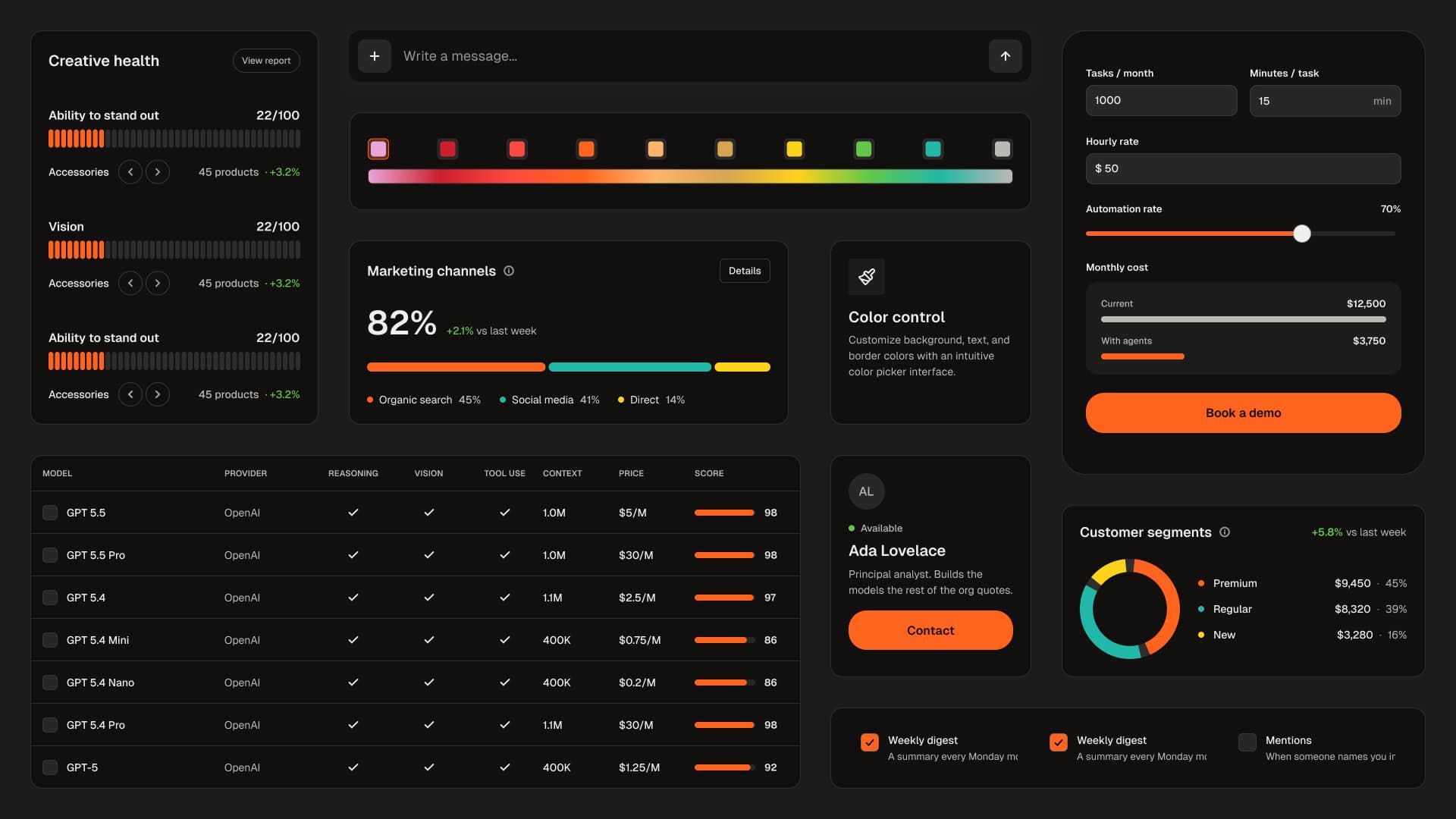
A vibrant, dark-mode-first design system for React. 50 components, two themes, and a token layer that makes off-system code fail to compile rather than fail
Type
Tech stack
Documentation
Basic
A README with setup and run steps.
Maintenance
Occasional
Occasional fixes, but no active roadmap.
Description
Halogen
A dark-first, warm, editorial design system for React. 50 components, two themes, and a token layer that makes off-system code fail to compile rather than fail review.
Halogen is built on Radix primitives and Tailwind v4. It ships the tokens, the components, and — unusually — the enforcement: the lint rules and build checks that keep a design system from drifting are part of the package, not part of the repo that made it.
The idea
Most design systems are a component library plus a document asking people to
behave. The document loses. Six months in, there is a #3B82F6 in a button, a
p-[13px] in a card, and a hex value nobody can trace to a decision.
Halogen replaces Tailwind's entire theme instead of extending it. After the token
layer loads, bg-blue-500 does not exist. Neither does p-7, rounded-3xl, or
backdrop-blur-md. They are not discouraged — they produce no CSS, and a build
check fails on any class that compiles to nothing.
50 components, two themes, and a token layer that makes going off-system a compile error rather than a code-review comment.
Most design systems are a component library plus a document asking people to behave. The document loses. Six months in there is a #3B82F6 in a button, a p-[13px] in a card, and a hex value nobody can trace to a decision.
Halogen replaces Tailwind's theme instead of extending it. After the token layer loads, bg-blue-500 does not exist. Neither does p-7, rounded-3xl or backdrop-blur-md. They are not discouraged — they produce no CSS, and a build check fails on any class that compiles to nothing.
What you get
- 50 components — buttons, forms, overlays, navigation, data display, four charts, and the patterns built from them. Full source, no black boxes.
- Both themes, and the OKLCH derivation engine that produced them. Light is a real fork of the palette, not an inversion.
- A two-layer token system — primitives and semantics, with components able to reference only the semantic layer.
- The enforcement, shipped to you: four ESLint rules plus three build checks that catch what lint cannot.
- Generated documentation — a page per component,
AGENTS.mdfor AI coding agents, andllms.txtfor the same. - A Figma variables export and a one-prompt kit that generates a matching Figma library into your own file.
Built on
React 18.3–19, Tailwind v4, Radix primitives, TypeScript. pnpm workspace. Self-hosted Geist — no CDN request from your production pages.
The four enforcement mechanisms
- Namespace replacement. Tailwind's color, spacing, radius, font, shadow, ease, breakpoint and z-index namespaces are reset and reopened to an explicit whitelist.
bluris reset with nothing declared back. - Four lint rules — no primitive colors, no arbitrary values, no gradients on controls, no
aria-labelon roleless elements. - A dead-utility check that runs the real Tailwind compiler over every class in your source and fails on anything producing no CSS. This is the check for the failure with no symptom: rename a token and every class still compiles — into nothing.
- A tailwind-merge check, because custom namespaces must be taught to it or your override silently loses to the component's own class.
Run the whole bar with one command: pnpm verify.
What is verified
- 377 token tests — contrast in both themes, forbidden pairs, elevation perceptibility
- 288 unit tests
- 172 browser tests — Playwright and axe: keyboard, focus management, reduced motion, forced-colors, reflow at six widths, the accessibility tree
- 118 mutations, every one caught
The mutation sweep is the part worth explaining. A test that has never failed is a claim, not a guard — so each assertion is verified by reintroducing the bug it exists to catch and confirming it goes red. Several tests were found to be checking nothing this way.
Accessibility, stated precisely
Designed to WCAG 2.2 Level AA and automatically tested against it. Every color pair asserted in both themes; keyboard operation, focus management, reduced motion, touch-target size, reflow, forced-colors and the accessibility tree verified in a real browser on every commit. Not tested with a screen reader, not independently audited, Chromium only. No conformance claimed.
A 60-check screen-reader checklist is included so a buyer with a procurement obligation can run the pass themselves.
What is not included
Named plainly, because a kit that hides its edges is worse than one that names them.
- A published registry. Halogen installs as a workspace package today; a one-command installer is not built.
- Storybook coverage — 7 stories for 50 components. The written reference is complete; the interactive one is not.
- A prebuilt Figma library. The variables export and the generator prompt are included; t
Domains
Seller

Reviews
No reviews yet.