
Uplink Design System — Next.js + Tailwind 4 UI Kit for SaaS & Developer Tools, with Tokens, 21 Components, App Patterns & Docs Site
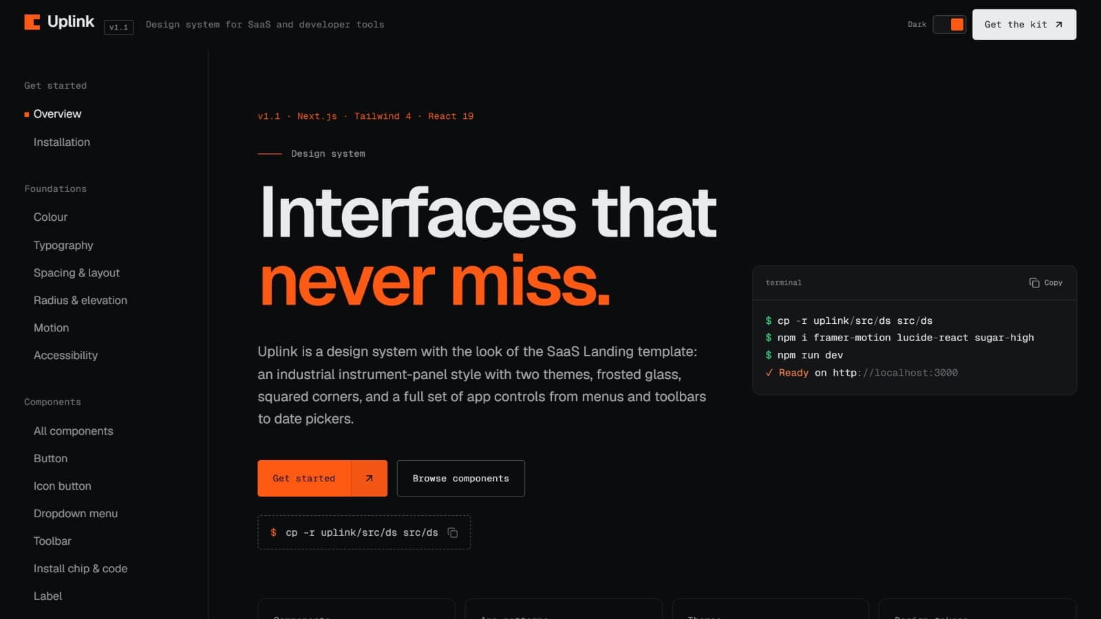
A design system, not an app: tokens, 21 components from menus to date pickers, 5 app patterns and a docs site in two themes.
Type
Tech stack
Documentation
Full
Setup, architecture, and how the pieces fit together.
Maintenance
Occasional
Occasional fixes, but no active roadmap.
Description
This is a design system. You're buying the source code for a UI kit and its documentation site: design tokens, React components and app patterns you copy into your own Next.js project. It has the look of the SaaS Landing template, packaged for building dashboards, developer consoles and product UI. The companies and data in the examples are fictional.
What's inside
- Design tokens in one JSON file: colour roles for two themes, a fluid type scale, spacing, squared radii (including control, popover and item radii), shadows, easing curves, durations and layout. One command turns them into Tailwind 4 theme variables, so
bg-paper,text-ink,rounded-controlandease-outwork as utilities - 21 documented components: button with arrow cell, icon button, dropdown menu, toolbar, install chip and code block, label, badge and status light, panel and callout, section head, accordion, filter chips, text field / text area / select, input variants (icon, unit, character count, show-password, search with shortcut), checkbox, switch and segmented control, checkbox group with select-all, radio group (list or cards), number stepper, date picker with calendar, toasts, theme toggle, plus keyboard keys, avatar and clock
- 5 app patterns: sign in, endpoint settings, API keys list with toolbar, plan upgrade checkout and demo scheduling, fully interactive and ready to copy
- A documentation site you can deploy for your team: foundations, a page per component with live examples, props tables, do/don't guidance and accessibility notes, plus a full token reference
Design
- An industrial, instrument-panel look: squared corners, hairline rules, frosted glass and a mono voice in sentence case
- Two themes, Dark (default, signal orange) and Light (electric violet), switched by one attribute
- Geist for display and body, Geist Mono for labels, values and code; menus pop from their trigger and numbers roll as they change
Accessibility
- WCAG contrast ratios computed from the tokens and shown in the docs; text pairs pass AA in both themes
- Menus, toolbars, radio groups, the stepper and the calendar follow WAI-ARIA keyboard patterns (arrow keys, Home/End, Escape returns focus)
- Real buttons, links and labelled inputs; visible focus everywhere; motion switches off for reduced motion
Easy to make yours
- Edit the JSON tokens and regenerate the CSS; components only use roles, so a new palette or corner style applies everywhere
- Every component is one typed file with no extra runtime beyond Framer Motion and Lucide icons
- The docs site ships with the source: rename it and deploy it as your own reference
Stack: Next.js 16 (App Router), React 19, TypeScript, Tailwind CSS 4, Framer Motion, Lucide icons.
Related products
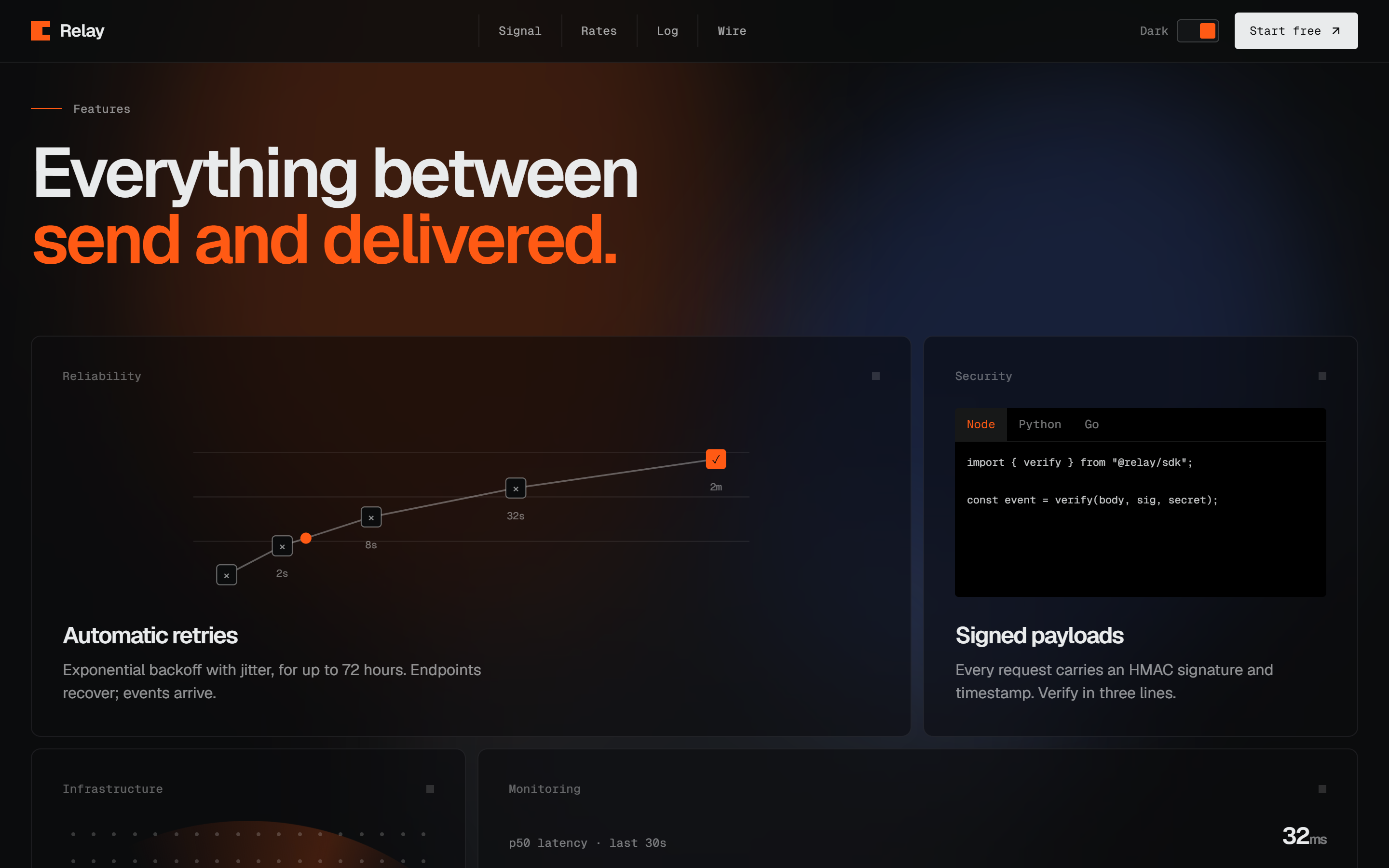
SaaS Landing Page Website Template — Next.js Marketing Site with Pricing, Changelog & Blog
A website template, not a product: a multi-page SaaS / dev-tool marketing site with pricing, changelog, blog and two themes. Next.js 16 + Tailwind 4.
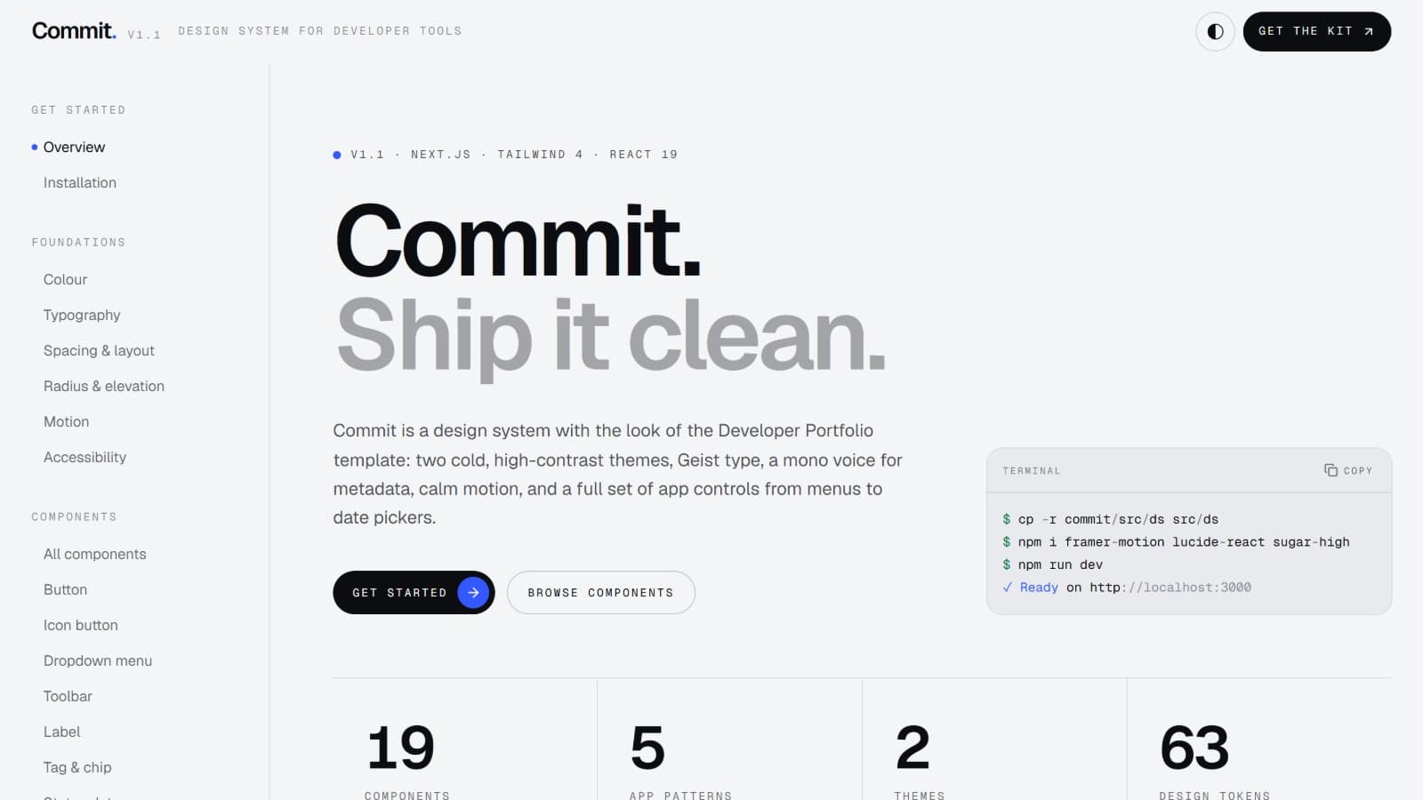
Commit Design System — Next.js + Tailwind 4 UI Kit with Tokens, 19 Components, App Patterns & Docs Site
A design system, not an app: tokens, 19 components from menus to date pickers, 5 app patterns and a docs site in two themes.
Domains
Seller

Reviews
No reviews yet.